When it comes to decorating our homes, we often encounter certain “rules” that dictate how we should use certain design elements. One such rule is the idea of sticking to one wallpaper design per space. However, Drew Barrymore challenges this notion by demonstrating how multiple wallpapers can be used effectively to enhance a small space.
Embracing Creativity and Personalization
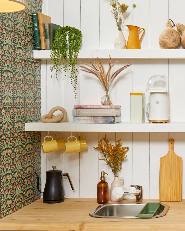
In her Small/Cool studio design theme for Apartment Therapy’s event, Barrymore showcases her penchant for creativity and personalization. Instead of adhering to the conventional wisdom of using a single wallpaper design, she opts for three distinct wallpapers to adorn different parts of the space.
The Power of Thoughtful Layering
Barrymore emphasizes the importance of thoughtful layering in design. Each wallpaper serves a specific purpose, contributing to the overall aesthetic and functionality of the room. From visually elongating the kitchen space with vertical shiplap wallpaper to infusing personality with textured vintage floral wallpaper, every choice is intentional.
Unconventional Applications
One of the most surprising aspects of Barrymore’s approach is her use of wallpaper on unconventional surfaces, such as the mini fridge. By covering the appliance with a vibrant wallpaper pattern, she adds a pop of color and transforms an ordinary object into a statement piece. This unconventional application highlights Barrymore’s willingness to think outside the box and push the boundaries of traditional design.

Maximizing Functionality
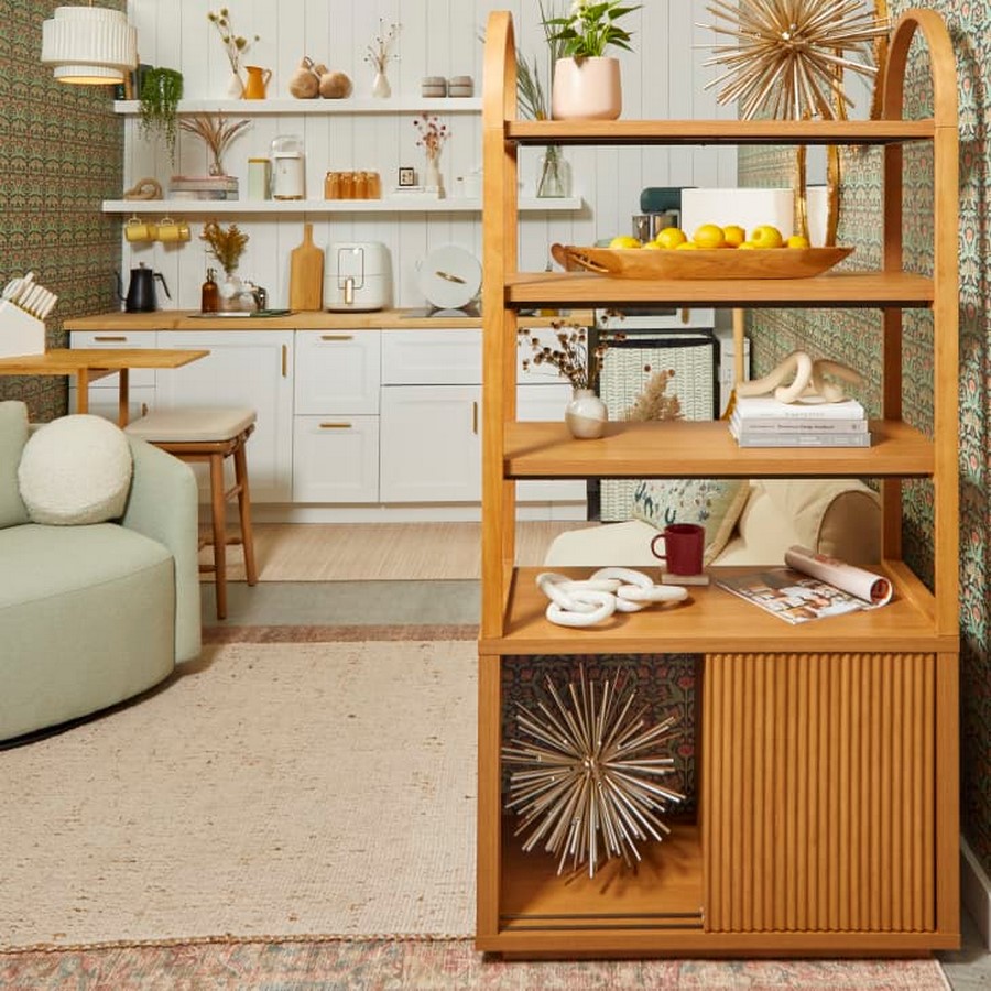
In addition to her creative use of wallpaper, Barrymore prioritizes functionality in her design choices. She selects furniture pieces that serve dual purposes, such as a versatile three-shelf bookcase that provides both storage and division in the room. This emphasis on functionality ensures that the space not only looks stylish but also meets practical needs.
A Lesson in Design Freedom
Ultimately, Barrymore’s design approach serves as a lesson in design freedom. By breaking the traditional rules and embracing her own instincts, she creates a space that is both comfortable and stylish. Her willingness to experiment with multiple wallpapers and unconventional applications inspires others to trust their creative instincts and design spaces that truly reflect their personalities and preferences.





Comments